As creatives and entrepreneurs, we are always developing and perfecting our craft. We aim to progress our expertise and expand our services. We want to connect ourselves with those we aspire to help and build upon the relationships we’ve been lucky enough to form in this business. As we’ve evolved, so has our brand. This past year has been full of many changes, opportunities, hurdles and blessings that have brought LP Creative to where it is today. We can see where we want our business going in the years ahead.
What started as a side project to design logos, graphics and small websites has now grown into a business that encompasses so much more. While design is still at the core of what we do, our expertise extends far beyond any single service. Our goal is to be the team you lean on to see any creative project through to fruition.
Background and Evolution
Before I took the leap and ventured into business on my own, I worked in marketing and was a freelance designer living in Omaha, Nebraska.
From the very beginning, I’ve always prided myself on offering quality, approachable design and personable one-on-one relationships. That’s what got me to where we are today and that won’t change.
When I started out in the freelance world in 2011, I went by the name “Lauren Prentiss Designs,” or “LP Designs.” Simple enough: it was my name (my maiden name) so that’s what I stuck with. In early 2014, my clientele base had grown. Incoming projects weren’t slowing down. So in the spring of that year I made a very big decision to take the leap, leave my full-time corporate job, and grow my branding and web design business full-time. As the business evolved into a “real” brand, the name and logo seemed to fit less and less. And so the birth of the original rebrand began.
The Original Rebrand and Early Exploration
In 2014, I relaunched the business with a new name and identity. I was now a married woman and had taken my husband’s last name. Legally I was now Lauren Hunt, but it didn’t feel right, at least at that time in my life, to say goodbye to my maiden name I held so dear (like so many of us women do). I was going to keep that in my business name somehow, some way. Looking back now this sounds silly, but it still holds the same meaning to me and always will, whether we change the name or not.
Design is a big part of what we specialize in, but I felt the word “creative” better encompassed everything we offer. It’s about the whole process: planning, strategizing, light bulb moments, and bringing ideas to life. We strive to be a creative advocate and catalyst to our clients. We’re not just here to deliver a project, we’re here to help build brands and reputations. We are rooted in relationships and strong communication. So with that strong conviction, the name LP Creative Co. emerged.
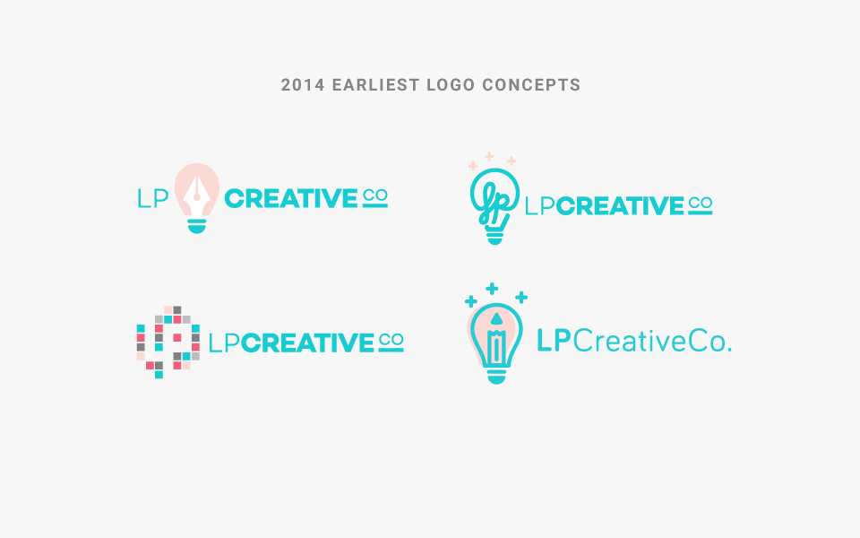
Below are some early concepts my team and I worked on for the Identity in 2014. In those early explorations, I envisioned the icon being the shape of a light bulb, symbolizing creative spark and light bulb’ moments we have as a design studio. I had hoped to tie in “LP” as an element within the logomark.
Today’s Brand Refresh: further design refinement
2016 is when the development of our new, updated website got off the ground and coding began. Our outdated website wasn’t properly reflecting who we are, and most importantly, wasn’t reflecting all of the services that we now offer. This was where our refresh started, which led into everything getting an updated look and a fresh palette.
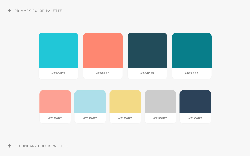
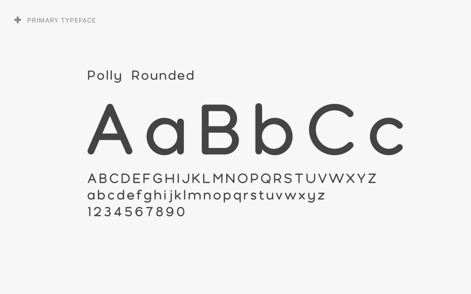
Hours of research went into selecting a new color palette. The old LP turquoise has been updated with a slightly more vibrant shade of blue and the pink accent color has been changed to a bright and cheerful coral. We also selected a new typeface for the identity that echoes the round, geometric forms of the brand icon. The new wordmark uses the Polly Rounded typeface. It is lightweight, soft, with a cleaner aesthetic. We wanted to keep it simple and legible but have a more fun and friendly essence. The old wordmark was very restricted and tight. The new logomark allows for more space and breathing room in the wordmark and characters within.
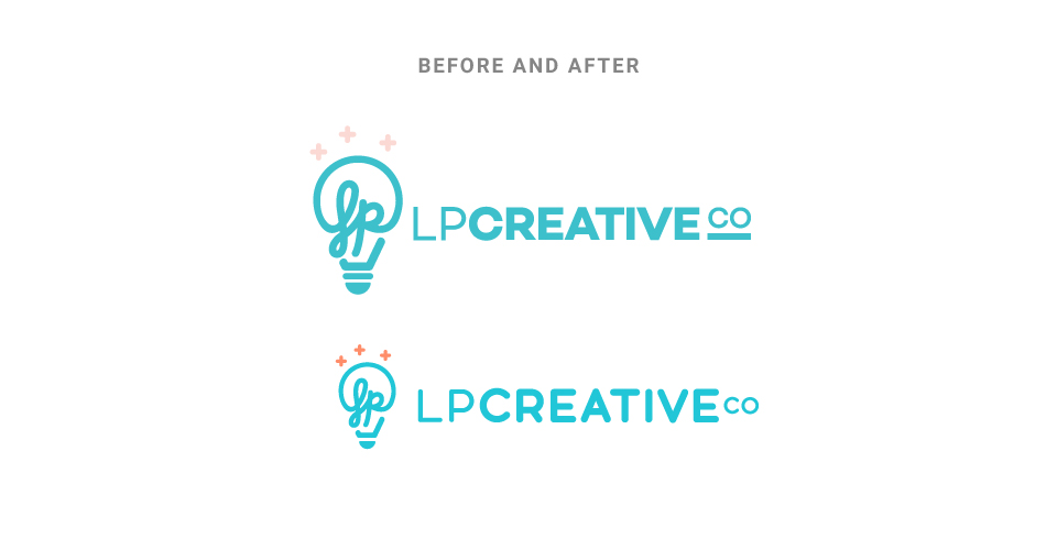
The Updated Icon
To accompany the cleaner lines of the new wordmark, we also cleaned up the icon. Our goal was to tweak the icon just enough to scale it to smaller sizes more easily. By doing this, it could be used in smaller applications or in places where the wordmark doesn’t make sense. A bottom piece of the light bulb was eliminated, improving the scale of the height. This improved how it displayed in smaller sizes. Our icon is a recognizable mark in our brand so we didn’t want to steer too far from the original.
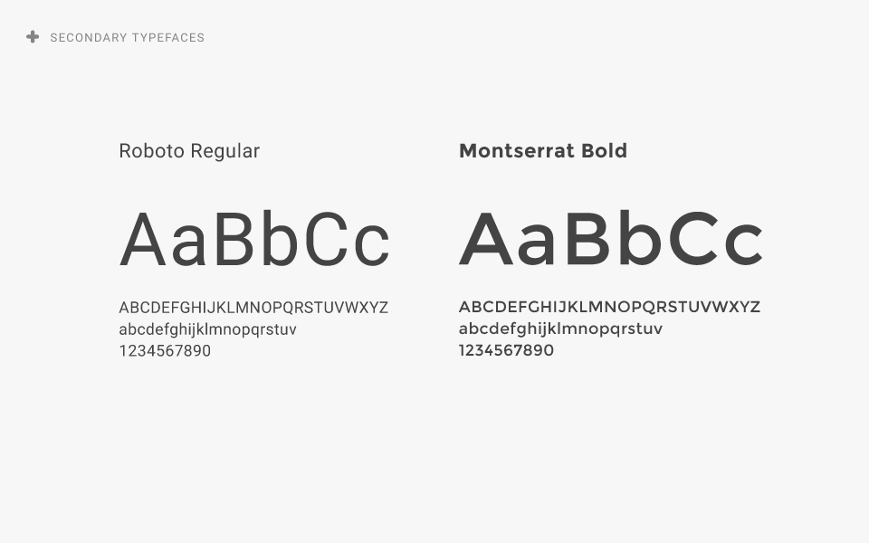
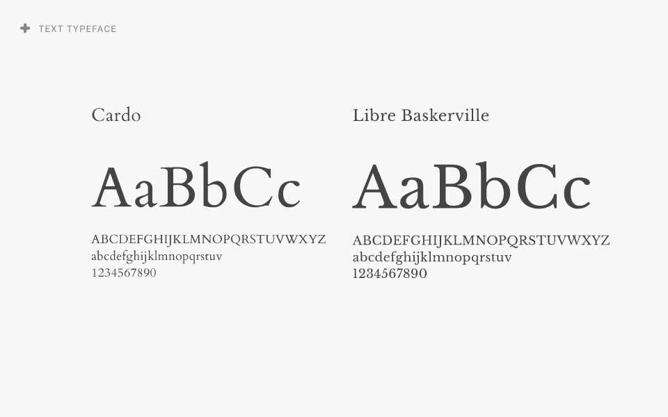
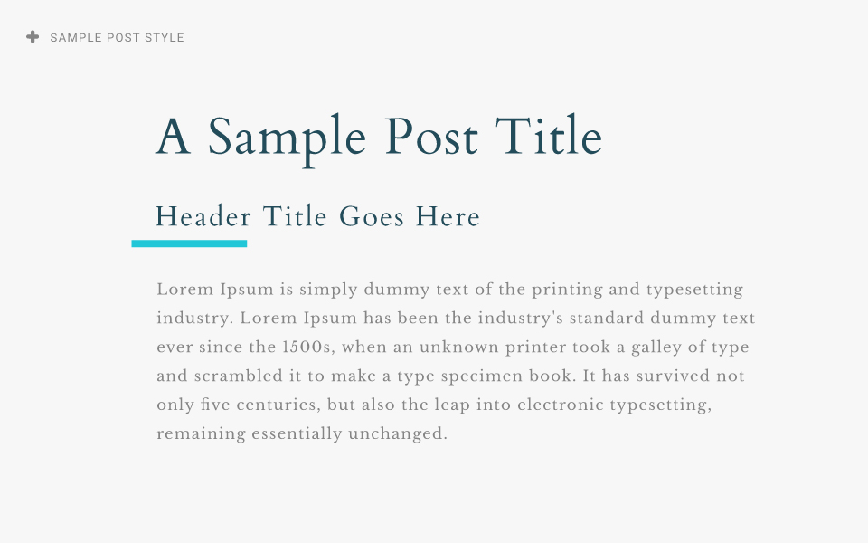
Brand Style Guide
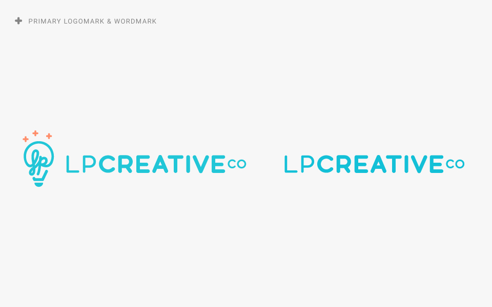
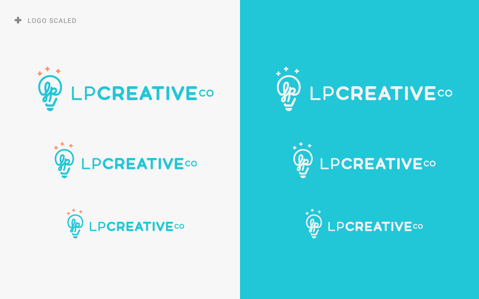
As part of the larger brand refresh, I put a lot of thought into the style guide that would define the refreshed LP Creative Co. Designing a logo is just a small part in how a brand is communicated. The selection of colors, typefaces and how elements will be used bring a consistent feeling to each medium. Here’s a look at some of the new style guide:

That brings us to where LP Creative Co. is at now. Things have evolved, and we’re excited about it. But what hasn’t changed is our commitment to creating quality design. Hope you enjoyed a peek at some of the thought that went into the brand refresh. It feels great to have a new website and refreshed brand that reflects what LP Creative Co. is all about.
If you’re in the rebranding stage yourself, or are thinking it might be time for a refresh, feel free to send us a message. We’d love to chat with you more about it.
Tags: Branding, Graphic Design