Table of Contents
As a full-service web design and digital marketing business operating for almost a decade, LP Creative Co. has enjoyed having the opportunity to evolve. As years go by, standards change, marketing trends come and go, and technology continues to race into the future.
The last thing we want to do is stay the same! So, we’re turning toward the future by reviewing our past.
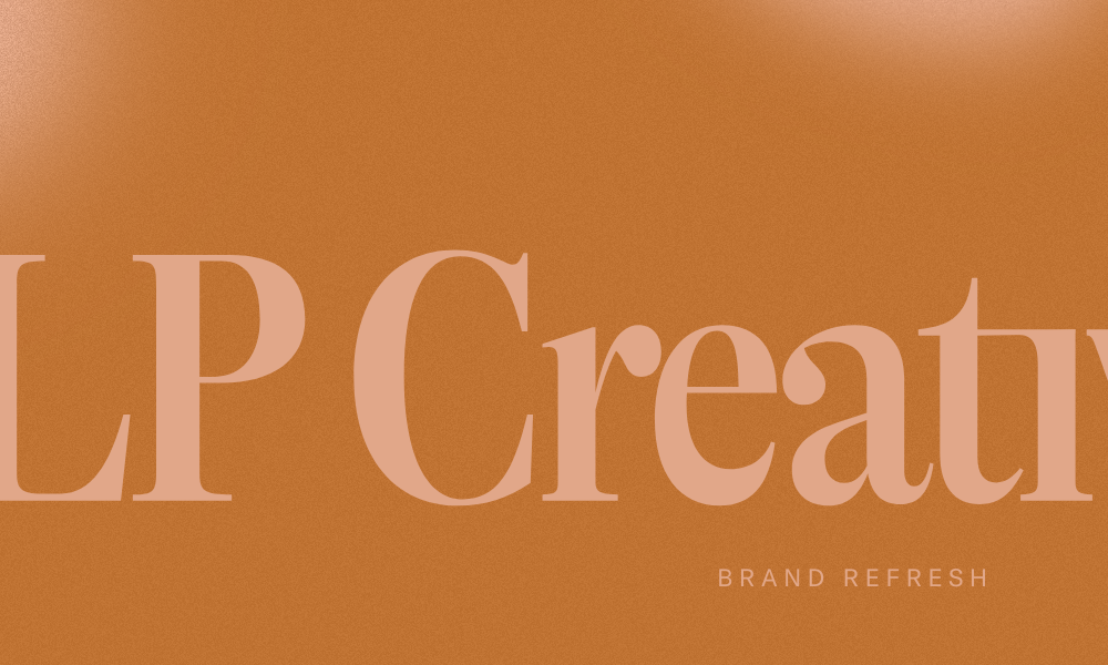
As you may have noticed, our newest brand refresh is quite different than our first one, and was built as a celebration of what has helped us thrive over the years:
The relationships we cultivate with our clients.
Back to Basics
This new iteration of LP Creative Co. hearkens back to our midwestern roots with a warmer, more welcoming aesthetic. In an industry full of fast talk and flash, we keep coming back to the fact that success is built on the quality of your products and services, and the quality of the relationships you build.
What Our Customers Are Saying About Our Digital & Web Design Services
This time around, we reached out to our longest-standing clients in order to get an idea of why they’ve stayed with us for so long. Some common words we heard were:
- Truth
- Honesty
- Organized
- Creative
- Professional
Hearing this feedback from these wonderful clients was a good reminder: among all the change, one thing has remained constant, and that is our desire to cultivate relationships that work and last.
A Welcoming Pallette
The colors used in this rebrand are distinctly different from those of our last. Our designer for the new site, Stetson, chose to use a blend of both muted and bright colors, designed to inspire a feeling of coziness and warmth mixed with an unmistakable feeling of daring. We want these colors to communicate that we are trustworthy and dependable, all while showing off our appreciation for bold, thoughtful, open-minded design.
Branding Typeface: More Than Meets the Eye
When it comes to our design and branding process, we pay close attention to even the smallest details. And, while we certainly don’t consider typeface to be a small detail, we do take into account the finer nuances of this branding design element, making sure it’s just as aligned with the brand as the colors and logo.
Our designer chose GT Alpina as LP Creative Co.’s typeface family for its timeless elegance and familiarity.
Even with our typeface, we’re waving a bright “hello” to the future, while tipping our hats to our history.
Logo Design That Speaks To Our Brand: Same Idea, Fresh New Look
LP’s classic lightbulb icon hasn’t gone away, but it has taken a page out of this rebrand’s book by pairing a sleek, modern simplicity with a highly recognizable classic look. By riffing on the vintage edison bulb — a vestige of the past, yes, but one that was very progressive at the time — we are able to uphold our dedication to innovation while reminding current and prospective clients that we are an institution you can trust to light your way to success and satisfaction.
Graphic Design & Visuals change, but our standards don’t.
LP Creative Co. has always been dedicated to providing high-quality web and design services to the clients who put their trust in us, and that is not going to change. We want to heartily thank the clients who have been with us through the years, and reassure our new visitors that they’ll receive the same top-notch quality our clients have come to expect from us.
We’re happy you’re here, and can’t wait to move forward together!
“LP Creative Co. is the best of the best! They guided our company through a big brand refresh project, and we couldn’t have done it without their expertise, kindness, and patience! They gracefully handled many opinions, loads of back-and-forth communication, and meticulous revisions. The new branding is something we’re proud of and feel that it perfectly represents where we are today as a company.” ~ Whitney Novellino, MagView Director of Marketing
