 close
close
How to Understand Responsive Design
To understand responsive web design, we first need a little history lesson.
Let’s go back to about 10 years ago, 1 year before the release of the original iPhone. The browser on your phone was, well, awful. Essentially it would show you a list of links, pictures, and text in a single column. You would generally navigate this by using the navigation keys on your phone (left, right, up and down).
So what did this mean for building a website? You more or less had to build two websites, neither was terribly complicated at the time. But the mobile browser was the epitome of not very complicated. Simply put, the phone itself didn’t allow you to be very creative.
2007 was a big leap forward
Jump forward to 2007, the introduction of the first iPhone. It’s truly incredible to watch the video of Steve Jobs presenting the iPhone because so many of the features on our phones we use every day simply did not exist prior to this presentation.
This was a big leap forward for browsing the web. But this also brought a new problem, in order to read anything on your phone you would have to pinch in and pinch out, over and over again. So web developers and designers responded by making sites optimized for your phone. This was done in two ways. The first was by navigating to a completely separate site. So instead of going to example.com you would go to m.example.com (the “m” stands for mobile) and it would load a mobile friendly version of the site. But this is a really difficult way of building a website because you’re building a site twice.
Prior to 2007, you could get away with building the second site because a) the Desktop version (laptop or home computer) of your site would look bad on the phone and b) it didn’t take a lot of time to create the mobile site.
But as of 2007 the new tools on mobile browsers allow us to actually create a nice looking (and more user-friendly) version of your desktop site. Additionally, 56% of the traffic on the top 10,000 sites came from mobile devices (iPhones, Androids, iPads, etc). If your site isn’t compatible with mobile devices, you could be leaving your visitors hanging out to dry.
Source: https://www.similarweb.com/corp/the-state-of-mobile-web-in-the-us-2015/
Okay, so creating the site twice takes a lot of time, what’s the second option?
Responsive Web Design
Responsive design lets the elements on a website respond to the screen size of the person viewing the page. So what does that really mean? Let’s say you have a two column website:
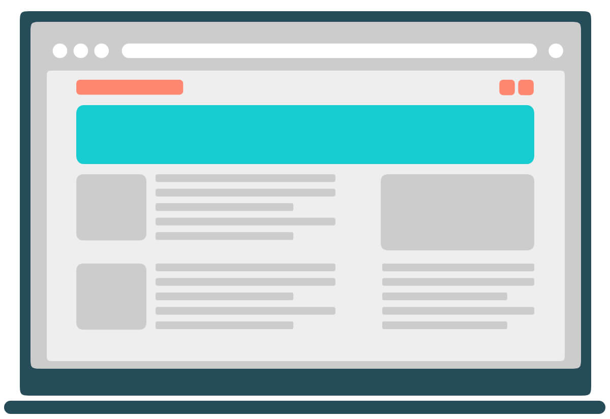
You have the main content on the left side and the information sidebar on the right. Looks good on the desktop.
In the real world, we have measurements like inches, centimeters, etc. The computer world is no different, but they’re called “pixels”. When building a website we are able to see the height and width of your browser by pixels. So the picture above might be viewed in a web browser that’s 1,240 pixels wide.
Anytime we change the width of the browser, the size of the website can “respond” or fit to the screen.

So let’s imagine a website doesn’t have responsive design. What happens if we make the browser smaller?
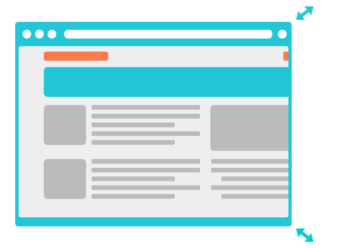
Yikes! That’s not good, a part of the website is getting cut off. Fear not, responsive design can fix this. Like any kind of design, this isn’t simply something we can install, when the code is actually being written we will essentially tell our site, once the browser is a certain number of pixels wide, make sure everything else scales down to fit in the browser. You can use something called a “media query” to define when and how much to scale down elements of your site.
So let’s see what our website looks like now:
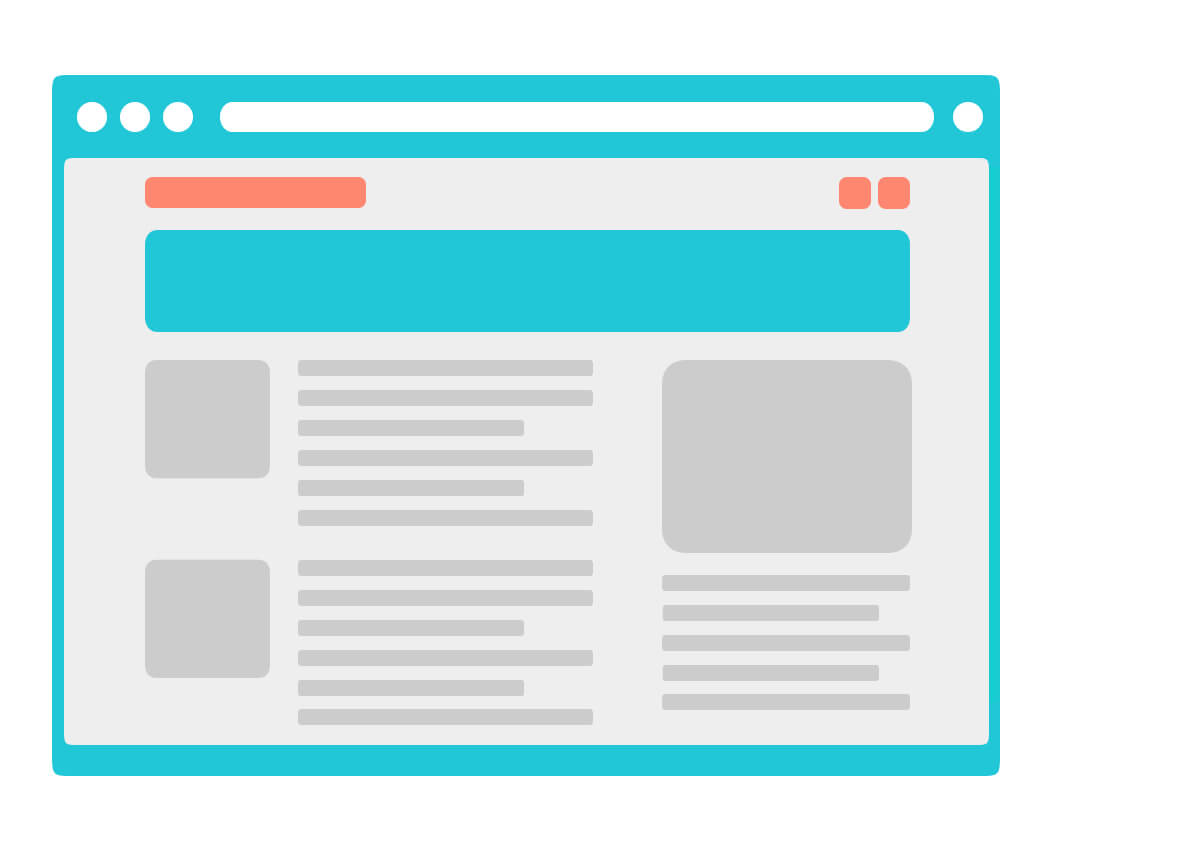
Looks good! Now it’s just a bit more narrow but you don’t have content running off the screen. This makes the site a lot more user-friendly.
Responsive Websites allow for a better user experience
When building a responsive website, you still need to write more code, but it’s significantly less than building two completely separate websites. This is better for the experience of your users and it’s much more cost and time effective.
And now to bring it full circle, what if we’re viewing on a smartphone?
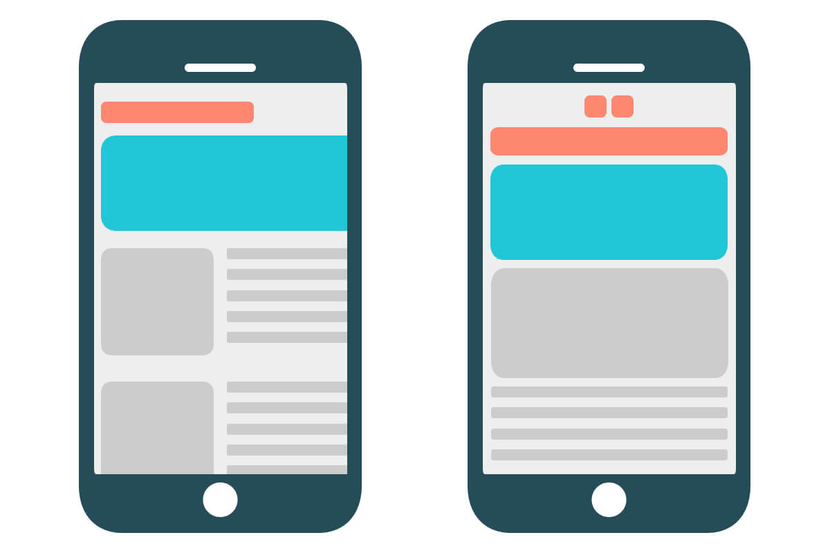
You’ll notice in the first image there’s still things floating off the screen. With responsive design we can also tell the site when it’s time to stack things on top of each other instead of being in a singular column.
So to recap, responsive design lets us build our code once and view it on any size screen. Which is important since over half of all internet traffic to the top 10,000 websites came from mobile devices in 2015. When your developer builds a responsive site, they’re adding some more code to make sure it’s optimized for any size display you’re looking at. This means your users can enjoy the content of your website much easier while saving you the money and time of building two completely separate websites (one for mobile and one for desktop).
And remember, it’s always easier to make your site responsive from the beginning rather than going back and doing it later.
Tags: Small Business