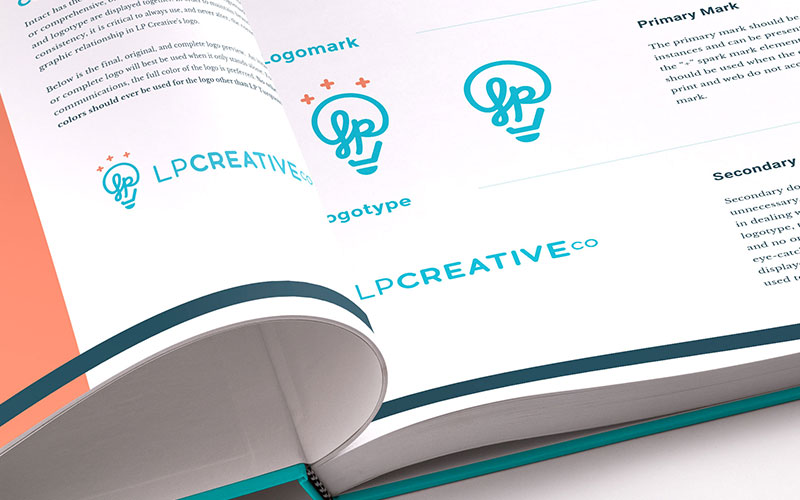
Every brand, however big or small, should have a set of cohesive brand guidelines to maintain its identity. Your brand is the face of your business; it projects your identity and defines how your clients and prospects view your business. Shouldn’t you value having a guide to place in the hands of every person who touches your brand? The answer is yes. This is extremely valuable to your company and its reputation.
What is a Brand Style Guide?
A brand style guide—or “brand guidelines”—is the primary visual of your company’s branding. Your brand’s visual identity includes your logo, tagline, color scheme, typography and graphics. A strong style guide can range anywhere from 5-500 pages. This document lays out how the brand should be portrayed, however formal or informal. It defines and presents examples of what your brand looks like in various visual media such as print and web. It lists the “rules” of consistency so a company knows how to use their new branding files correctly and successfully.
This is a handbook for how to properly express your brand: where and how to use the logo, colors, fonts and just as importantly, how NOT to use them, in order to consistently communicate the message.
One Guide to Tether
Once you have a brand style guide, it is imperative that you keep it up-to-date and in the hands of everyone who touches your brand. In most companies, several people and departments will have their hands on the brand before content is delivered to the public. To assure your brand remains consistent across all channels, everyone within your company should adhere to the same guidelines when creating and designing all marketing collateral. A well-documented brand style guide will tether all who touch your brand together. This gives your clients and prospective customers a cohesive experience and a unified marketing message.
Without a unifying guide, your branding may appear inconsistent and incorrect across different channels. We’ve seen it all too often; the colors of a company’s logo get changed and suddenly you see a new shade of bright purple being brought in and makes the logo look unprofessional and inconsistent with other branding. This results in mixed marketing messages that confuses your followers. It could also negatively impact the perception your company gives to prospects. You don’t want the brand you’ve poured your sweat and tears into to become diluted in the eyes of your target audience.
Brand Style Guide Essentials
Here are a few examples of some key elements you should include in your brand style guide:
Logo variations
Many brands have a primary logo as well as alternative logos to give them versatility. When designing for clients, we focus on designing a primary logo to be used for most applications (website, business cards, and other important materials). The alternative logos are for other applications where the primary logo will not fit. It’s important to outline how and when each logo variation should be used to maintain professionalism and consistency throughout your brand. Consider these questions:
- Will the logo appear the same for both web and print?
- What will the logo look like on a white background? A colored background? A photo background?
- How much space needs to be left around the logo?
Fonts
Many businesses and blogs are all over the place with their font choices. This makes their website overwhelming and unprofessional. In order to cut down on confusion and create consistency on both web and print materials, consider these questions:
- What is your body font for web? For print? What are the sizes for each?
- What is your header font for web? For print? What are the sizes for each?
- Are there specific character styles (like all caps) for any of your fonts or text styles?
Designer note: We usually recommend no more than 2-4 font choices per brand, to keep things simple, professional, and streamlined.
Colors
To streamline your colors and ensure they are the same tint and shade across all platforms, think through the following questions:
- What are your primary brand colors? What are they used for?
- How about your secondary brand colors? What are they used for?
- What are the values for each color? (This makes it easy to assemble your colors and also provides a quick reference)
- What color is your body text? What color are your headers?
Does your company need any assistance in building a brand style guide? You may have a company brand or even just a logo, but need help building your style guide. Or perhaps you are deciding if it’s the right time to rebrand your business. If you’d like to learn more, contact us today.


