Table of Contents
You have a fantastic logo. It looks great on company letterhead, on your email signature, and on business cards. So why would you need variations of it? Logo versatility is important because as your business grows, your logo will be in more places. Each of these places will have their own requirements for how they will accept your logo (like different dimensions and file sizes). Think of it like different holes your company’s logo will need to fit.
Let me give a quick example: Once I worked at a company which asked me to order pens to give out at an upcoming conference. Sure. I could do that. How hard could it be to order some pens with our logo on them? Harder than I expected, it turned out. Because at the time of the company’s branding, they had only one color logo created. That meant I needed to track down the original designer to obtain both a vectorized image and a black and white one.
But if the company I worked for had anticipated where their logo would go, there could have been a file on the shared drive with each of the logo variations we needed. Ordering pens would have been a breeze that took a few minutes, rather than a few days. Your company can maintain its visibility without the headache by having LP Creative make the logo variations you will need as a part of your Brand Style Guide.
What’s a Logo Variation?
A logo variation is a modified version of your logo that you use in specific instances: sometimes due to size or to vary your look (so you aren’t having to just “put” your logo on every single thing you do.) Regardless of which logo you use most often (known as your “primary”), you need to have each of these variations:
- Horizontal
- Vertical or “Stacked”
- Icon “Brandmark”
- Wordmark “Logotype”
- One-Color and Reversed Out
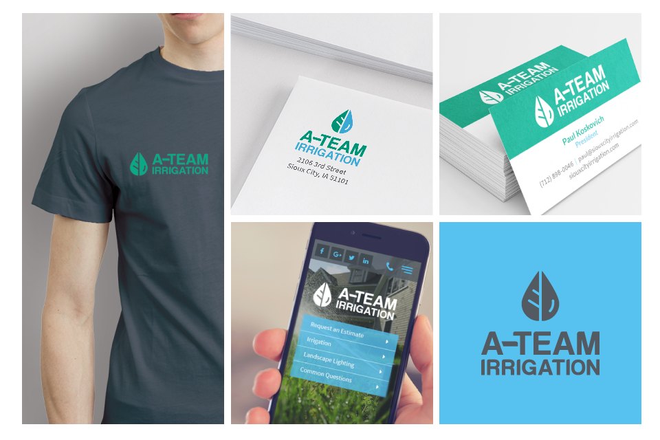
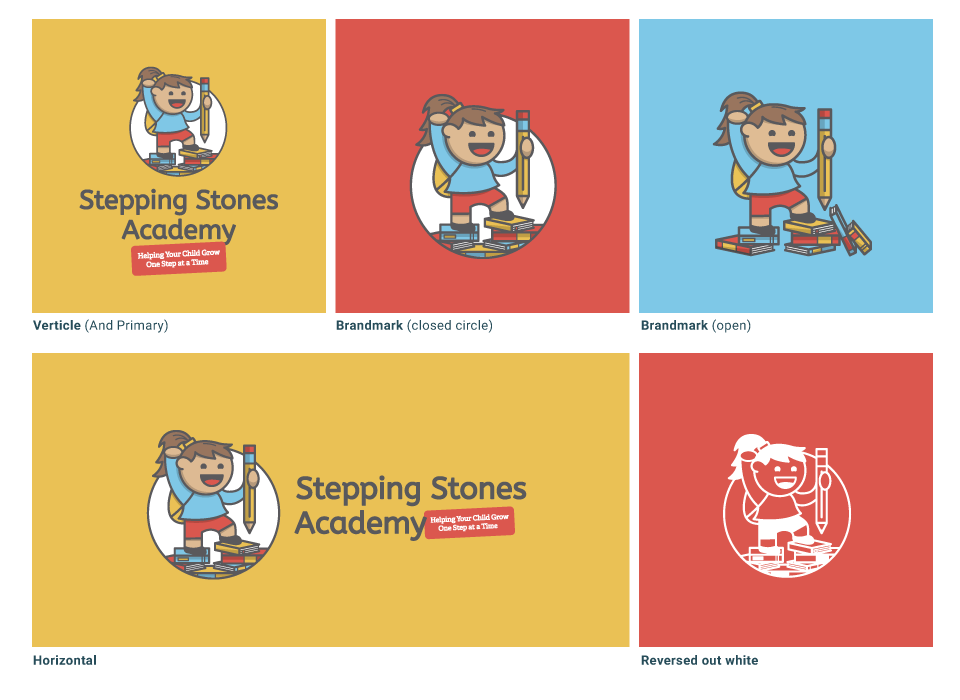
Let me show you what I mean. Here’s a look at the Primary Logo and Logo Variations for A-Team Irrigation and Stepping Stones Academy, branding by LP Creative.
Logo Variations Elevate Your Brand
One of the first steps in building your business involves branding, not just your logo. A key component to your brand’s identity involves several visual elements, the most important being Logo design. Whether you’re creating a website, business cards, or print collateral, a logo is a key visual component and holds the design together. When designing websites, you should never start without having your logo, typography and color scheme established.
The logo can tie the entire project together or could ruin it if you don’t have the right logo to build from. It needs to be perfect from the beginning, because you never should have to make changes to the logo once you start working on something else. But, is one logo enough? Imagine trying to make one piece of art fit into many different settings: it just won’t work. That’s why LP Creative recommends that every brand we are involved with builds variations of their logo so that they can fit into any format or atmosphere.
Horizontal Logo
An ideal shape for a logo is a horizontal rectangle. That doesn’t mean that the actual shape of the logo needs to be a rectangle, but the live area should be like a wide rectangle. A horizontal logo can be used on your website, corporate invoice and stationary or online and in print where the vertical logo doesn’t fit.
Vertical or Stacked Logo
You’ll need a square or stacked logo variation for when the space on print or web do not accommodate the horizontal logo. Favicons and avatars are two common places where you may need to represent your company or brand with a small, square version of your logo. Your avatar most likely will be used on your social media profiles like Facebook and Twitter.
Icon & Wordmark
It’s beneficial to also have a custom icon or “mark” that acts almost as an extension of your logo. A mark or icon can be used to literally mark your work/client touch points without slapping your whole logo on everything.
Brands with a distinctive wordmark (the typography) and icon (brandmark) benefit from using these elements together or individually to represent their brand. The arrangement of the components of a logo will help your brand work in different media. A stacked, centered layout works well on labels and signage, but a horizontal layout may be best in the header of a website, in a banner ad, or on the spine of a printed brief or annual report. The A-Team Irrigation branding is an excellent example of these icon and wordmark variations.
The Single-Color & Reversed-Out Logo
This is the ultimate test of a logo’s strength and versatility. A single-color option is simple and instantly readable. It prepares you for one-color printing for business cards, letterhead, and packaging. Even if your logo is colorful, it is a good idea to have a solid black and reversed-out white version.
If you are missing some of these, it is something to consider for your business this year. Think about the new places your logo could be if you had variations of it. LP Creative is about making day-to-day things easier on small business owners.


