Table of Contents
Logos. Everyone knows them, everyone loves them. Having a favorite logo is about as common as having a favorite color or favorite music artist. However, when people say “logo,” they are typically referring to one, solitary image. For example, when I say “Apple logo” you probably instantly think of the ubiquitous Apple logomark that adorns all of their electronics, as opposed to the typography-based version of the logo that actually says the word “Apple.” However, a “logo” can take on multiple forms including being a logomark, logotype, and a combination of the two. Let’s take a dive into the various types of logos, and how companies create logo systems that can represent their brand in all channels of media.
Logomark
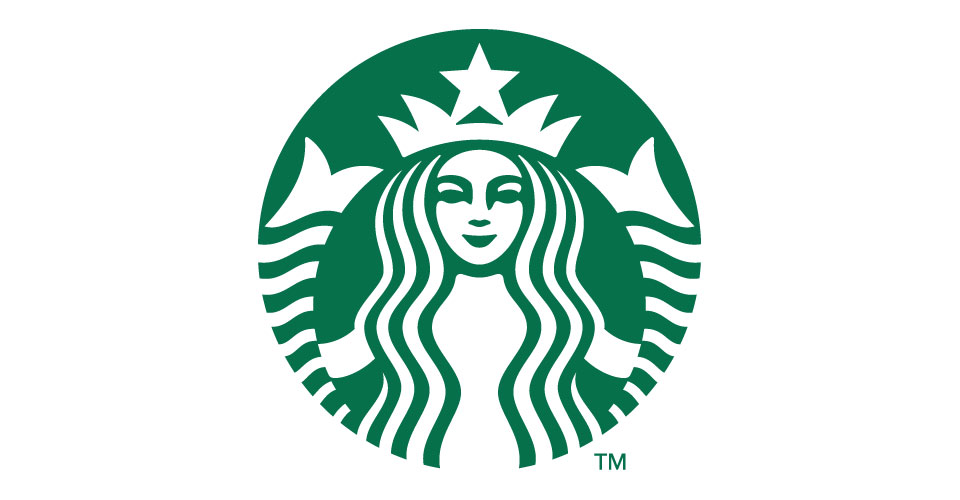
The logomark is hands-down the most iconic part of almost any logo and is typically what initially draws people into a brand. Instead of using words to communicate the company’s brand, it uses graphics. For instance, take a look at this logomark down here:
We all know that one right? Starbucks! Obviously!
But wait, how do we really know that it’s Starbucks? After all, it’s just a random drawing of a siren. It’s not like it actually says “Starbucks.” Well, that’s the power of a good logomark. We’re all extremely familiar with the famous Starbucks siren, and instantly associate it with the company despite the fact that the company name is absent from the graphic altogether. It’s simple and memorable, just as a logomark should be. However, while the logomark does a stellar job of representing Starbucks to people that know about Starbucks, it falls flat when viewed by people who know nothing about the company. That’s why the logomark isn’t the only logo the Starbucks marketing team has up their sleeve.
Logotype
Unlike the logomark, the logotype does consist of the typography used to spell the name of the company. It is a piece of typography that is custom-tailored to the company it’s representing, and carries a voice unique to the business. Remember our Starbucks logomark example? Well let’s take a look at the matching logotype:
Although the Starbucks logotype isn’t the kingpin of the Starbucks visual identity, it is still very identifiably “Starbucks.” You may be thinking, “Well, obviously it is for Starbucks because that’s literally what it says.” While that is very much true, the way the logotype is styled also helps represent the Starbucks brand. The font choice, the color, and the letter spacing all work together to make you feel as though Starbucks is a quality coffee shop. That customization is precisely what makes logotype, logotype!
*Note – Some companies choose to forego a logomark altogether in favor of just using logotype.
Combination Logo
You may have already guessed this one, but the combination logo is… wait for it… a combination of the logomark and the logotype! I know, the suspense was killing you.
Kidding aside, the combination logo is the perfect marriage of graphics and type. It takes both the logomark and logotype and juxtaposes them together, making the combination logo, otherwise known as a “lockup.” Combination logos come in a variety of forms and businesses will often use several forms of combination logo. For example, let’s come back to our Starbucks example:
This is the horizontal combination logo for Starbucks. As you can see, while the logomark and logotype can certainly stand on their own and represent Starbucks well, the combination logo has the best of both worlds by combining the memorability and interest of the logomark with the brass-tacks messaging of the logotype.
What Makes an Effective Logo Design?
Versatility. Having a logo that can be split up, swapped around, scaled up and scaled down is crucial for maintaining a strong brand in all your outward-facing media channels. Logo versatility is important because as your business grows, your logo will be in more places.
Picture for a moment the starbucks wordmark being stuffed into a tiny profile image on Facebook. At a certain point, you wouldn’t even be able to read those letters to know that it’s Starbucks. That’s where the logomark comes in. The simple siren icon has a perfectly circular shape, allowing you to fit the whole image into your square Facebook profile without wasting any space, effectively increasing legibility.
Where the logomark fails though, the logotype more than picks up the slack. Sometimes, you need something that can fill a different size space. Let’s say for instance, the printable space on a pen. Sure, you can fit the logomark on it, but it would be really small. Since the pen has a long, rectangular shape, the logomark would be more suitable given that it more closely matches the printable area of the pen.
Logo Variations Elevate Your Brand
One of the first steps in building your business involves branding, not just your logo. A key component to your brand’s identity involves several visual elements, the most important being Logo design. Whether you’re creating a website, business cards, or print collateral, a logo is a key visual component and holds the design together.
If you are missing some of these, it is something to consider for your business this year. Think about the new places your logo could be if your brand had versatility. LP Creative Co. is about making day-to-day things easier on small business owners.


